Usability Audit — PhonePe QR Scanner
“Where the f%@& is the QR code scanner?”
Those are the golden words I tend to repeat often when I have to use PhonePe to pay a merchant using a QR Code scanner.
Thanks to the Digital India and Demonetisation initiative, stickers like these are placed prominently at any kind of merchants in Bangalore —

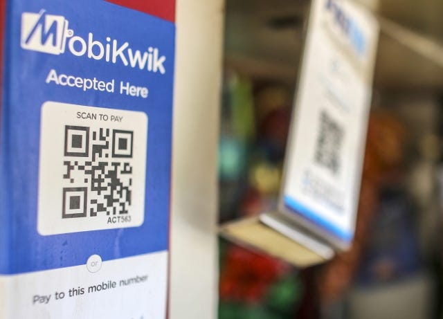
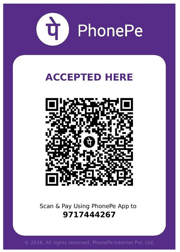
I usually use Paytm to pay at Merchants as where I shop regularly they all use Paytm and it's more convenient to refill and stick to one Payment app than use many.
The other day I visit my regular merchant who had a new kind of sticker —
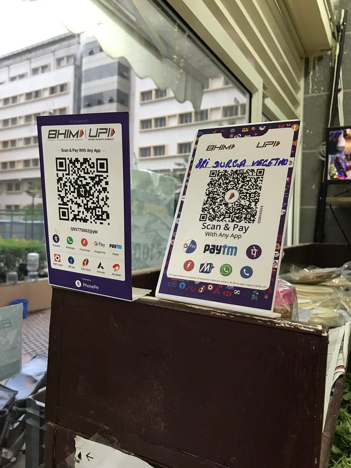
This is UPI where the money is directly debited from my Bank Account as against Paytm where it's more like a digital wallet/prepaid card. One can also pay using UPI/Credit and Debit card even on Paytm and other payment apps but it involves extra steps as against paying using Paytm Wallet.
Since I had not registered UPI on my Paytm app, I decided to use PhonePe. After all, I use it fairly often to pay on various food ordering apps like Zomato, Swiggy, UberEats…and now with a QR Code, it’s gonna be a cakewalk.
Alas, …it was a nightmare and instead I decided to pay using Credit Card and walked out.
Here is why…
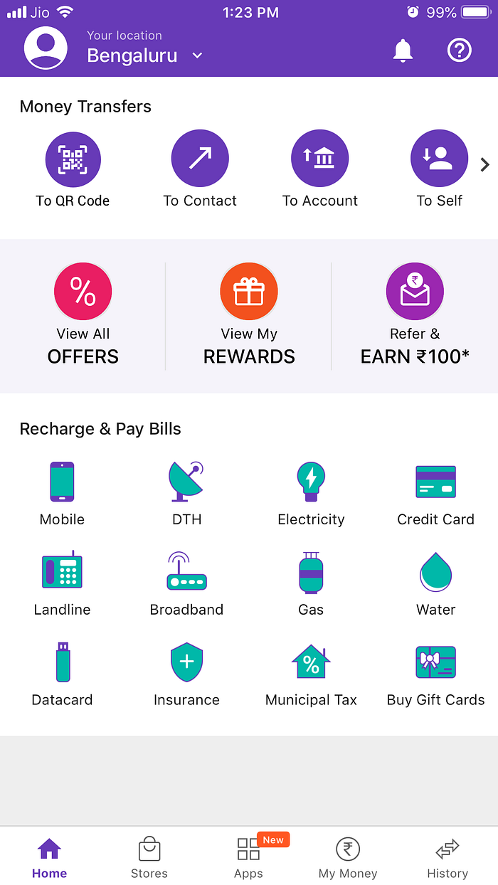
When I opened PhonePe, this is what I got—

All I had to do was scan the QR Code. Sounds simple, right!
The problem, I couldn’t find where to Scan the code.
My natural place to look was “To Contact” which is the first link under “Money Transfers”. When I went there I saw —

It showed all my Contacts, but couldn’t find a place to scan a QR Code.
Went back to home screen, this time tried “To Accounts” —
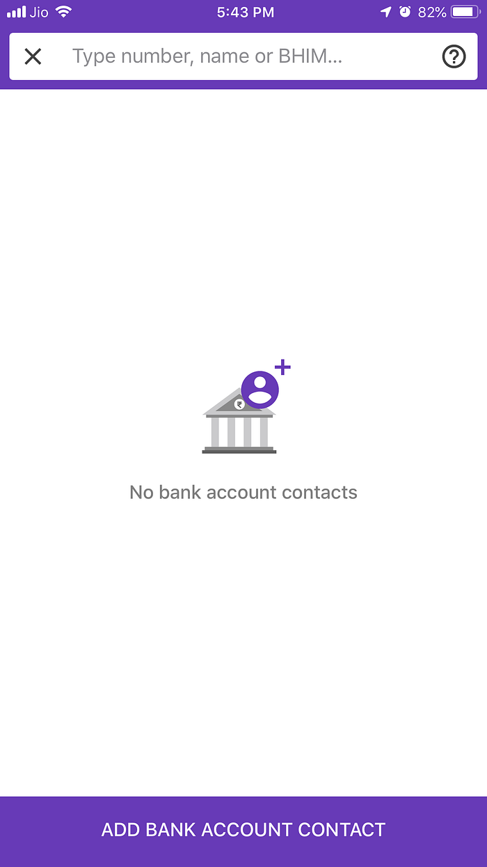
It was about Bank Accounts added. Hmmm…
I went to various other links in the app but couldn’t find the QR code scanner.
Frustrated, I took out my Credit Card to pay and left.
Later on, when I thought of it, it felt unbelievable. There is these QR Code everywhere, many have the PhonePe endorsement and yet did they forgot to add a QR Code scanner or was I too intellectually deprived to find it in the app.
I decided to give one more shot, not live at a merchant but in leisure, I decided and took an oath to find the QR code anyhow.
And I finally found it, it was right there when I opened the app!

In my view, it is the wrong place to have the feature to scan a QR code. Here is why —
It’s placed next to Notifications and Help. Both these are not part of a regular flow when using PhonePe for the primary job which is to Pay someone.
It’s placed above Money Transfer, it feels like an obvious information layout mistake.
Recommendation
Have it under Money Transfer —
It’s obvious to not miss and will probably save a lot many users like me not to say the golden words. :)
If any PhonePe Product Managers/Designers/Researchers are reading this, I am curious to learn why was it placed the way it is currently? Was there any Usability Tests done with actual users which led to the decision?
